Friday 22 October 2010

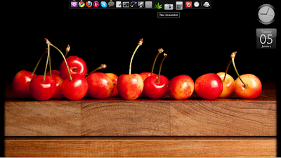
Apparently, my panel shadow = a desktop icon?!

So, I recently did a clean install of Ubuntu 10.10 Maverick Meerkat. It went really smoothly, done and dusted in less than half an hour! As it turns out, I probably didn't have to do it...

One of the main reasons I decided to do a clean install was because no matter what I did, if I had desktop effects turned on, I couldn't get a drop shadow on my panel. I know, pretty obsessive-compulsive, that just the lack of a single drop-shadow would make me reinstall, but hey. You should know by now how desperately perfectionistic I am when it comes to my desktop!

Today, I learned that I probably didn't need to do it at all.

One of the first things I noticed about my new install was that icons showed up on my desktop when I mounted external drives. Since I usually have Conky sitting on my desktop, I don't like icons because they don't play nice with the Conky window. I know there's a way to turn off desktop icons with gconf-editor, but I couldn't remember what it was, and I couldn't be bothered to look it up, so laziness prompted me to install Ubuntu Tweak. I had Ubuntu Tweak on my last install and found it really helpful, so I figured there was probably a setting in there to turn off desktop icons. And I was right; in fact, "Desktop Icons" have their own shortcut! But look what happened when I went to turn them off:

Icons on

Icons off

For some insane reason, when I turn off desktop icons, my drop shadow disappears! Which begs the question: if I had tweaked that setting in my old install, would I have got my drop shadow back? And whose bug is this? Compiz? Gnome? Ubuntu?

So for the time being, icons are "turned on," but I've unticked all the options in Ubuntu Tweak, so it effectively doesn't show anything.  How this will interact with Conky, I don't know, since I haven't updated my Conky yet.  I will keep you updated...
Sunday 10 October 2010

I'm coming back...Slowly...

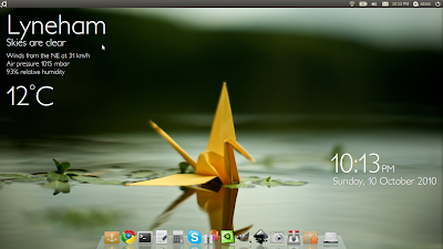
Hi all...Well, after a short hiatus for the purpose of procreation (I gave birth to my second child, Dakota, back in August), I am slowly getting back into customisation. Slowly! First things first, I changed my wallpaper! (And slightly tweaked Conky, but I bet you won't be able to tell.) Here's what my desktop looks like now, using an old wallpaper from fiftyfootshadows.net, one that I'd forgotten how much I love.

Incidentally, today's my birthday, so feel free to wish me "happy birthday" if you so wish. No, no takers? *Sigh*

Wednesday 2 June 2010

Make Your Desktop Look Like a Tablet...

...with almost entirely stock Ubuntu themes!

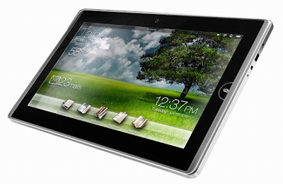
I was recently inspired by the following picture of a new Asus Tablet computer:

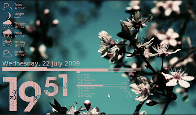
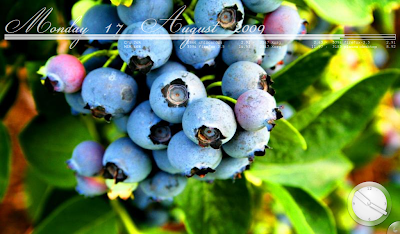
I liked the simplicity and functionality of the top toolbar, the eye-candy of the bottom launcher bar, and the big, easy to read desktop info. Instantly I was reminded of some of my older Conky configs, before I got into Lua/Cairo/imlib. Remember this one?

Anyway, I thought it was about time to go back to the roots of Conky. After all, more "active desktop" information is being used these days as netbooks and tablet PCs infiltrate the market. We don't have as much screen real estate as we used to, so the space we do have has to work harder. Plus, with the increased focus on location-based applications (e.g. Foursquare, Gowalla, etc.) and smartphones, we expect to see different information on our computers, like the weather.

While Conky is still considered to be an "expert's" tool for Linux, it remains arguably the best, most customisable system monitor. Add to that the fact that it is continually integrating new features, like weather forecasting, RGBA support, and more, and Conky has the potential to be the go-to application for displaying active desktop information on Linux boxes of all varieties.

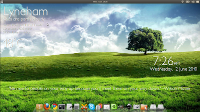
Beyond the Conky, my aim this time around was to make an attractive desktop layout using as few "customisations" as possible. In this case, I used the stock Ubuntu "Ambience" theme as a base, a Conky with no external scripts whatsoever, and a minimal amount of customisation, to get the following:


The elements I used are:
  • A beautiful tree wallpaper: This one, I found with a simple Google search for "tree cloud wallpaper".
  • Ambience GTK/Metacity theme: This bad boy ships with Ubuntu 10.04 (The Lucid Lynx) and is one of the slickest darkish themes around.
  • Docky, using the "glass" theme: You'll have to add a third-party repository to get Docky, but the glass theme I used ships with it by default.
  • Conky, with no external scripts: You can grab the .conkyrc file here. This was done using Conky 1.8.0, which is available in the official Ubuntu 10.04 repositories. This particular config uses the built-in weather variable to grab local weather data, and a neat little bash script at the end to grab a daily quote from tinybuddha.com. Please note that the font used here is Petita Light, available on Dafont.com, although you can use any font you like the look of. (You may need a bit of tweaking the $voffset and $goto variables.)
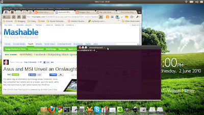
...and that's it. Other personal changes I've made that you might notice are that I use Chrome browser (with the Ambience theme installed) and that I've changed my pointers to be the Oxygen ones from KDE. Not making these changes probably won't affect the overall look of the desktop much! I also add Compiz, so I can have wobbly windows. Don't hate me.

Monday 3 May 2010

Mark Shuttleworth >> Window indicators

Mark Shuttleworth >> Blog Archive >> Window indicators

Mark Shuttleworth, Canonical CEO, has today given us a glimpse of what the controversial future of the window titlebar might look like in Ubuntu!

The heroes of the story are what are being called "windicators", e.g. indicators within windows. When I first read it over on OMG! Ubuntu! I thought, "Hang on, they'll be putting wind direction indicators in Ubuntu?" But I digress...

I, for one, am excited by the idea. I don't know how it will eventually get fleshed out, but I'm fairly certain that it will be awkward for a few releases, with the first iteration showing up in Maverick Meerkat (10.10). As with all new technology, it will take a few muddles and scuffles before it really shows what it can do.

But the bottom line is that "windicators" sound like a great new idea, of which there seem to be a distinct lack these days, amongst the major OSes. This has the potential to be one of the great features that make me proud to be an Ubuntu user.

Wednesday 3 March 2010

Ubuntu Announces Rebranding

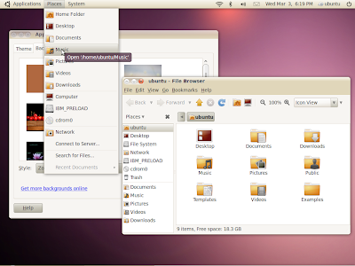
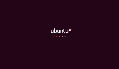
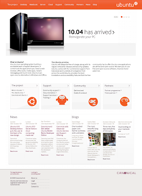
If any of you out there are Ubuntu fans like me, you'll be over the moon to read Jono Bacon's announcement about Ubuntu's rebranding! Here's the short version: the colour palette has shifted from brown with orange accents to a lovely aubergine with orange accents, and the whole visual style has been designed around the theme "light". Some hardcore Ubuntu-ites are already crying out for the loss of their beloved brown, but I for one see the change as welcome, and the look overall is more professional and polished than before. The new colours and style make Ubuntu look sleek and modern, and will help promote its position as one of the "big" mainstream operating systems.

Here are a few shots from the branding wiki page (which at the time of posting was only intermittently available, due to "technical constraints or capacity issues"!):


Well done to Jono and the team!

Tuesday 2 March 2010

The Real Reason I Can't Bring Myself to Switch to KDE

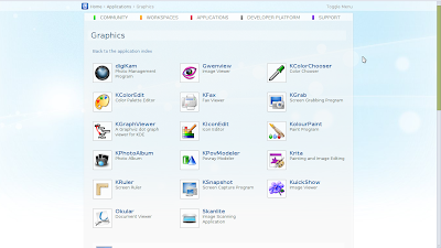
I have tried KDE now, three times. And I've actually managed to get some great eye-candy out of it...In fact, in terms of looks, I do ADORE KDE. Some examples of what I've done with it in the past:
From Screenshots
From Screenshots
However, there's one little thing that means I can never quite stick with it! You might be forgiven for thinking it was one of the following:
  • It is too resource-heavy compared to Gnome
  • It annoys me slightly that the panel never matches the windows
  • The zoom out feature is still a bit buggy
  • The customisation settings, while more extensive than stock Gnome, are more difficult to get a grip of
  • That damn KDE wallet asks me for my password every time I come back from suspend
...and so on and so forth. But in the end, all of these things are just little niggles, things that you would get over in time, just by using the desktop environment, and getting to know it better.

So what is it, then, you ask? Don't laugh...

Native KDE applications all have ridiculous names!!!

They all appear to be contrived to contain a "K" in some way, like when high school kids decide that it's not "wicked", it's "wikid". Or they just get lazy, and stick a "K" on the front of a literal name describing exactly what the application does. All you have to do is take a look at KDE's website to see what I mean:


So let's examine the evidence, and compare some Gnome and KDE default applications:
  • Web browsers: Firefox vs. Konqueror
    I suppose Konqueror is more than just a web browser, so maybe that's what they were going for with the whole "conqueror" epithet, but it doesn't excuse the "K". It's up there with "Hed Kandi", "Krazy Glue" and "Krazy Kamp" (the musical my middle school put on in the 7th grade).
  • Mail Clients: Evolution vs. KMail
    The lack of imagination here is just staggering. Could we not come up with a better name than "KMail" for a mail client in KDE?
  • BitTorrent Clients: Transmission vs. KTorrent
    See above. Come on, guys, let's have a little naming creativity here!
  • Music players: Rhythmbox vs. amaroK, now Amarok
    This one is arguably the weakest example, since the name actually means something in another language ("wolf" in Inuktitut), so the "K" is a transliteration anyway. Also, the dev team get points for seeing the light and fixing the capitalisation issue, which is what landed it on my list in the first place.
  • Feed readers: n/a vs. Akregator
    In fairness, this isn't quite an even comparison because Gnome doesn't ship with a default feed reader. But "Akregator"?! Come on, it's "aggregator", so at the very least, it should be "Akkregator" or something...Basically, there's no excuse for this one...
Now, I can't be completely one-sided here, as Gnome has its fair share of awkwardly-named applications, like gedit, but it's nowhere near the volume that KDE has.

What it all comes down to is that I get embarrassed telling people that I use applications with such ridiculous names. All the major OSes, including Windows and MacOS, put a lot of thought into the names of their applications, and I wish KDE would do the same. If they could crack that, they'd pretty much have a convert!

Thursday 4 February 2010

I Have a New Launchpad PPA!

After many weeks of hard work, hacking and general Linux sneakiness, I have finally managed to make myself a PPA on Launchpad! What does that mean for you, my lovely adoring public? It means that I can finally publish scripts and works in progress in a way that makes them much easier to update. You can add my PPA to your repositories list, so when you install my Conky Widgets script, for instance, whenever I update it, it will be automatically pushed to you via Update Manager (as long as you are using Ubuntu, of course!).

My new PPA is located here. If you would like to add it to your repositories list, from Ubuntu 9.10 Karmic Koala, simply type the following at the command line:
sudo add-apt-repository ppa:londonali1010/londonali1010
It will automatically add both the repository and the signing key to your sources list. If you are not running Karmic, please follow the instructions on my PPA page.

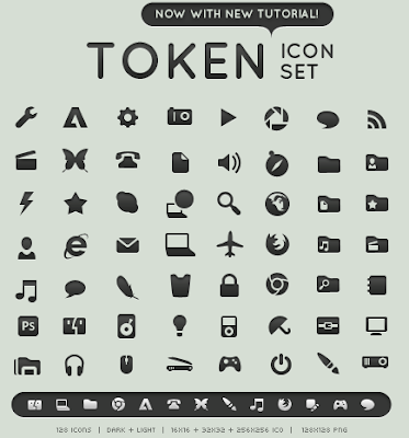
Anyway, the first package on the table is the "work in progress" that is my porting of the almighty Token icon set into a Gnome icon theme.

If you would like to have a go, please do, and leave me any feedback here!

Friday 15 January 2010

Iconizer: Customise Icons Easily from a Huge Library (Cross-Platform)

Like the icons above? I made them myself! In under 30 seconds!

I stumbled upon a new website today, iconizer.net, and it's just what a lot of customisers have been looking for: a way to quickly choose and customise icons for downloading, with a huge library of source icons, from several different OSes and styles. Available styles include MacOSX, Vista, Aero and others.

Here's a quick guide to creating your own customised icons with iconizer.net:
Start by going to the home page. Actually, it's pretty straightforward, but I'll walk you through it anyway...
Select the category of icon from the left list; it will pop up a sub-menu of styles you have to choose from. For instance, here I've selected Applications -> Panther.

Once you've selected your category and style, click on the "Select Icon" drop-down box:
At this point, you will be presented with all the available icons for your category and style; simply click on the one you'd like to use.
On the next screen, you can choose what to customise:
You can choose which file format (from .jpeg, .png, .gif, .bmp, .ico), whether you keep the original colour or not, and if not, what to use as a foreground and background colour. You can also choose whether your background is transparent or not, and the size of the icon.

Finally, press "Generate Icon".
Your icon will appear on the top right of the page. For some reason, it doesn't turn up on the page correctly in my browser, but hey, it is beta, after all! However, despite not displaying on the page, it downloads just fine.

Et voila! You've got a lovely custom icon that you can use to populate a launcher/dock, or replace an entire icon theme (if you've got the time)!

Have you used iconizer to generate a custom icon? Want to share it? Post it here!

Monday 11 January 2010

Success Secrets of the Graphic Design Superstars

Success Secrets of the Graphic Design Superstars

Simply essential reading, if you are interested in the world of graphic design.

The Driblet of an Aphorism: Surpassing Apple: Step One - Animate Everything

The Driblet of an Aphorism: Surpassing Apple: Step One - Animate Everything

I found this set of articles lurking in my Google Reader, and to be honest, I can't even remember how I stumbled across this blog in the first place!

Anyway, this link is to part one of a six-part series on "Surpassing Apple" -- basically, one designer's take on what we have to do design-wise, in order for Free Software to truly compete with, and beat, giants such as Apple.

Wednesday 6 January 2010

Sneak Preview of Conky 1.8.0

So...

I was tipped off whilst trolling the #conky channel on IRC that there would be new ARGB support in the 1.8.0 release candidate of Conky, so naturally I HAAAAD to try it out! I grabbed the latest version from here, and had a go...

First things first, I wanted to try out ARGB, in other words, REAL transparency, as opposed to pseudotransparency. For those of you who don't know the difference, pseudotransparency, rather than actually being see-through, detects what's drawn on the desktop window, and draws it as the Conky background, so it appears, on a blank desktop, as though it's clear. However, as we've seen before, pseudotransparency can cause some hiccups, if you're expecting it to behave like real transparency. It's a particular problem in KDE, for instance, which doesn't draw anything to the desktop window by default, so Conky ends up with a blank background.

In order to test the ARGB functionality, I made a little widget in Lua/Cairo that would be able to sit on top of my other windows, and here's what it came out as:
From My Little Desktop Photos
Note how you can see the corner of my window *through* the Conky widget...That's ARGB!

Some of you eagle-eyed readers may also have noticed that I said I used Lua/Cairo to draw the widget, but the last time I posted about text manipulation in Cairo, I was frustrated by the lack of a cairo_text_extents() object, which allows for centering and alignment of text. But it's now been compiled into the Cairo bindings Conky uses, so from v1.8.0, you'll be able to use it. The desktop I'm currently using has only Conky widgets on it:
From Screenshots
With the current setup, I'm starting to wonder what the benefits are of using Conky over Screenlets...I first thought that it would actually be more efficient to use Screenlets, because I thought they were compiled, but some clever clog pointed out to me that they are written in Python, so not compiled! I think the only barrier to Conky completely taking over Screenlets' territory now is the user-friendliness of Screenlets...Hm...